Dmitry Fadeyev is writing about icons in UI and the false sense of simplicity icons are giving us.
While he is talking about it in the context of concrete application, it remembered me transition from “traditional” toolbars to Ribbon bar, particularly in Office apps. Still, lots of people didn’t get the sense of the Ribbon, but I consider it as an improvement. The biggest advantage is feature discoverability.
Lets look at two screenshots. The first one:

First one is from Visual Studio 2010, a very traditional toolbar. Of course, there are other icons that being simple and intuitive give you enough confidence clicking them (think changing text alignment in Word). But to get a sense what will clicking on a unknown button will do you either will:
- get with mouse over it and read the tooltip (and you’re lucky if you have one, lots of application developers are not even bothering writing them)
- click the button and observe what happens
- forget the button and go to the menu and actually read trough menu items to find what are you looking for
Hmm, of course, over time you get more confortable with clicking on the buttons that look familiarly or are used often. But finding the features are still a pain.

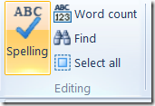
And then second screenshot showing a fragment of a Ribbon bar. We’re having here not only icons, but also a small label giving an instant hint for what the action will do. Then you even have an sense of the context, these actions are related to “Editing” the document. Click target is bigger than a 6x6 icon. And there are other advantages…
Yet the first toolbar is looking simpler, takes less place and over time it is easy enough in use. But any time when I see a complex application with a considerable number of options and actions, I would prefer a Ribbon instead. It’s about discoverability. It’s about first impression your application is giving to a new user. If you screw that, you’ll miss the user too…
Still, the Ribbon it’s not a panacea. It is not suitable for any kind of applications. Document oriented interfaces are genuinely fine for the Ribbon. But when you have data intensive apps, with lots of interactions, contextual actions, flexible layout and navigation – Ribbon may be not your choice…