How there is a lot of buzz in last few days about revamped Windows Azure, I cannot resist anymore and I’m giving it a try.
I’ve read few blog posts about new features, Metro style UI & improved tooling. But I was surprised by what I have seen when I logged in and tried to open the “Manage” part: the** Windows Azure Tour** application.
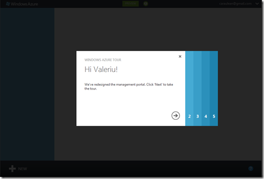
Instead of throwing the newcomer directly into Management panel, it offers you to take a tour and get some concepts of application and how to interact with it.
The idea itself is not new. Clippy the Office Assistant is the (annoying) forgotten hero born to help people dig into Office applications. More often other companies are offering a video introduction for their products or a series of “text + screenshots” slides to quickly explain usage of the product to new users.
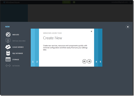
The approach Microsoft took with Windows Azure Tour is a bit different:
- It runs “within” application itself, giving impression of having the main application in background
- It gradually exposes application’s features in the same window
- Features are shown in exact same place where they are in application
- It looks & works great
And I quite like their Wizard-like walkthrough dialog. Smooth and subtle animations, clear visual indication of steps and current position, a bold exposure of Metro/Windows 8 style. I’m very tempted to try reproduce it in XAML…
Few more screenshots:
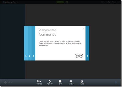
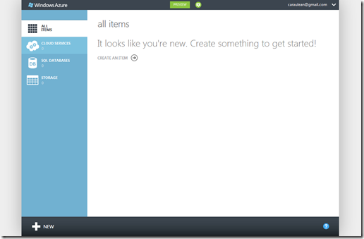
Finishing the Tour will take you to the main application screen:
That’s just my first impression about Azure. And most often is the one that counts the most. I think Microsoft have done a great job for presenting the new Azure. Let’s see now how it will be in real usage…
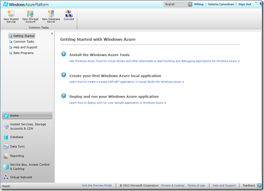
PS: If you haven’t seen the previous Azure portal, here is a screenshot: